Case Study: Notice
What is it?
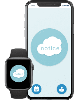
Notice is a mobile app designed to develop and facilitate the mindfulness technique of "noticing". Intrusive thoughts can really disrupt your day and taking time to notice these thoughts can help move past them. The Notice app has physical cues to help you notice free of judgment.
My Role:
Lead storyboarding and conducted user research
User Experience Design: creating user flows and wireframes
Created high fidelity wireframes to better demonstrate experience
This is a mock project intended to exhibit my design process.
User/Business Problem:
Intrusive thoughts and anxieties can make it feel like you are out of control.
Objectives:
Develop an app to guide mindfulness practices in a non-judgmental way.
Challenges:
Mobile devices can be the source of distractions.
How do we encourage the use of the app without becoming intrusive?
The Process
1
Empathize with the user
Starting with user research and storyboarding allows the team to get a good understanding of the user and how they could interact with the product. Using multiple research methodologies insures that we have robust data.
2
Understand the experience
Creating detailed user personas fosters empathy. Understanding the user to this degree allows us to predict how they might make decisions. This also helps to keep us focused on the user and not on the features.
3
Map user flows
Employing the user persona, I create user flows to map the actions that a user might take in order to reach their goals. I start with a low-fidelity prototype to iterate quickly and progress to more detailed prototypes as I continue.
4
Design Prototype
Developing a high-fidelity prototype allows the stakeholders to experience the product in a form closer to how it will be upon completion.The process of iteration/user research continues from here.
User Research
Quantitative Research:
A survey of users actively using meditation applications was conducted. A majority of users reported being overwhelmed by features. Participants who reported experiencing anxiety also reported a need for simple tools to build coping skills.
Additionally, we compared features of comparable apps with their number of downloads.
Qualitative Research:
After forming a focus group of users interested in mindfulness, we discovered that users prefer meditation tools that aren’t bogged down by too many features. Users expressed a preference for a simple user interface. Users attempting to build mindful practices want solutions that are easy to learn.
At this stage, research provides baseline metrics for the success of our design as well as the opportunity to make user-focused design choices.
Storyboard
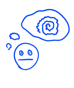
Intrusive thought
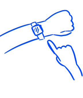
Open app
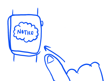
Tap to “notice”
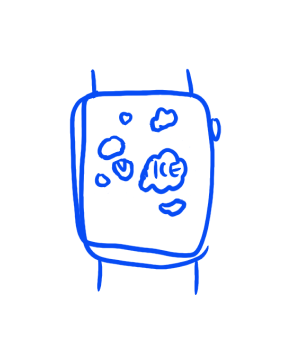
Noticed
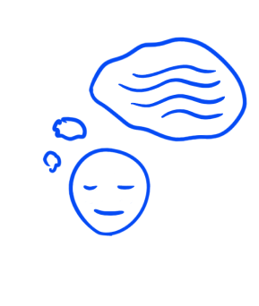
Peace of mind
Storyboarding helps to identify key parts of the experience of the user.
User Personas

Abby
Teen learning to develop skills to track and cope with her anxiety.
Needs to accomplish:
*Identify when she is feeling anxious
*Track this information without taking too much time
*Review tracked information
*Take notes about specific instances of feeling anxious
Needs to feel:
*Not judged
*Calm
*In-control
Things to consider:
*How can Abby navigate the app when she is feeling particularly anxious?
*Are there reminders for her to check tracked data?
Paige
Needs a way to practice new meditation techniques.
Needs to accomplish:
*Use physical cues as a reminder to "notice" her thoughts or feelings
*Must do so quickly and discreetly if she is otherwise busy (i.e. at work)
*Track her progress
Needs to feel:
*In-control
*Not distracted
*Empowered to continue self-growth
Things to consider:
*Can Paige use multiple devices?
User Flows
Abby
1
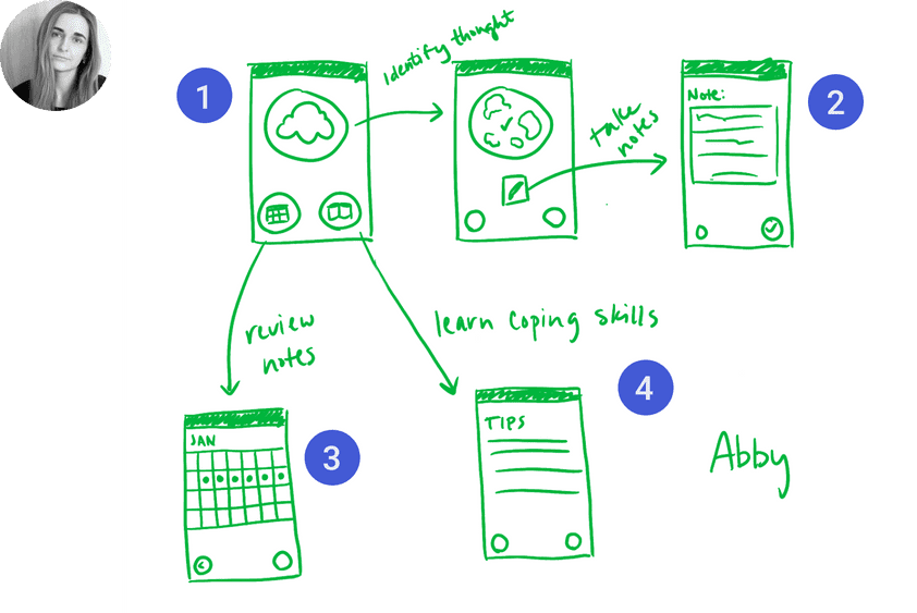
Tapping the “notice cloud” parallels Abby identifying her thoughts or emotions.
2
Abby can take notes about specific instances of feeling anxious.
3
At a glance, Abby can track the number of times she has noticed her thoughts/feelings.
4
Abby can read more about how mindfulness can help build coping skills.
Paige
1
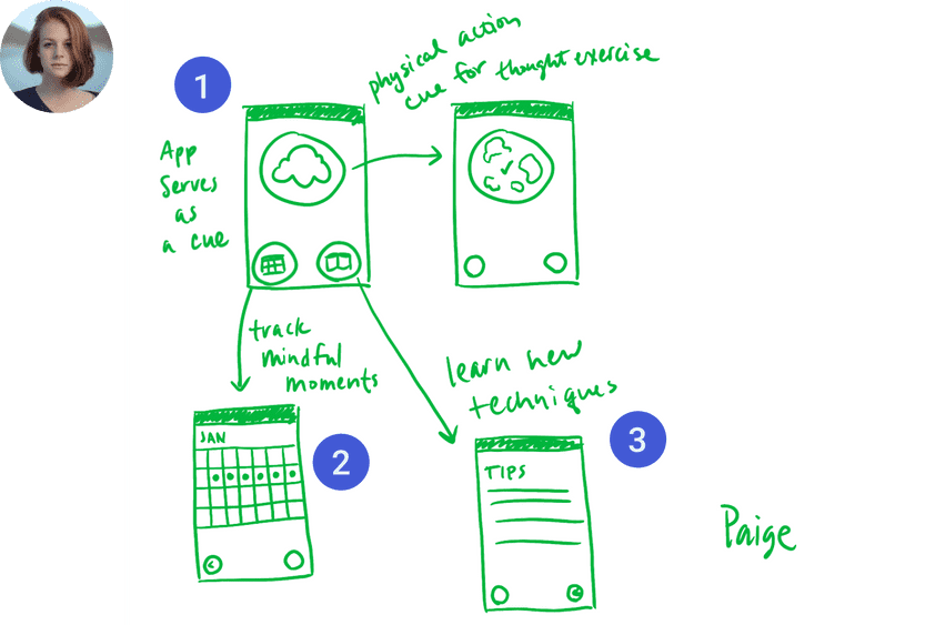
Paige needs the “notice cloud” as a physical cue to reminder her to notice her thoughts/feelings.
2
Using the calendar, Paige can track her progress learning these techniques.
3
Readings allow Paige to better understand how to be mindful throughout the day.
Wireframes
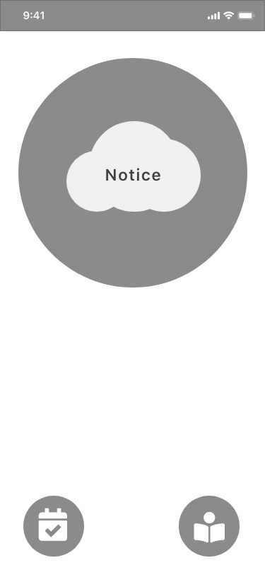
Home Screen
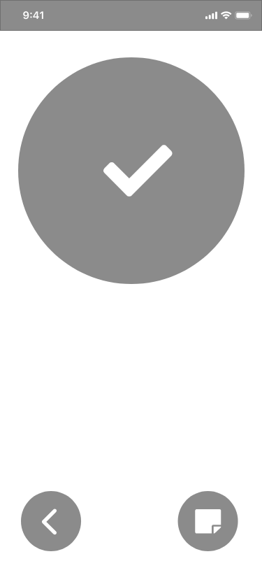
Noticed
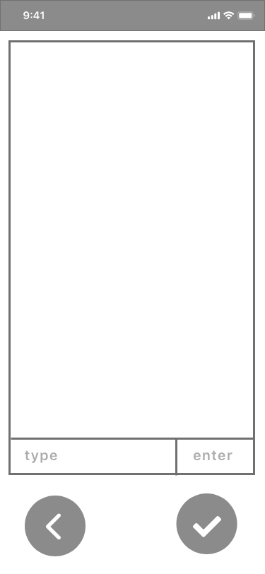
Note
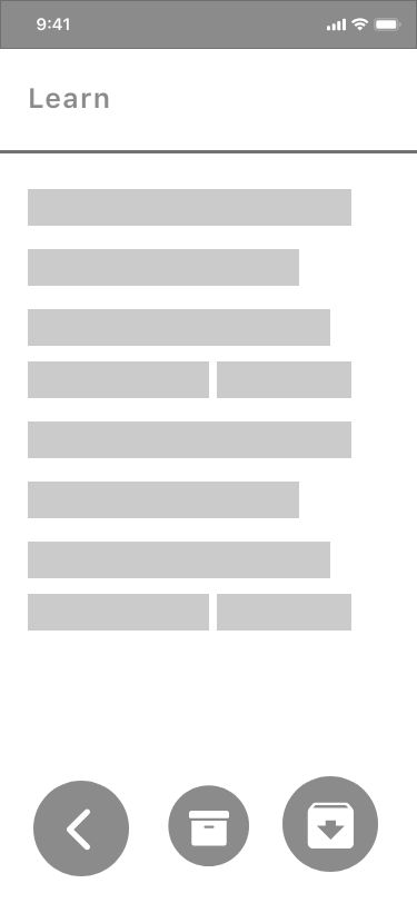
Read
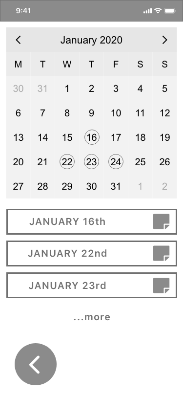
Track
User flows helped to identify key screens to develop.
Prototype
1
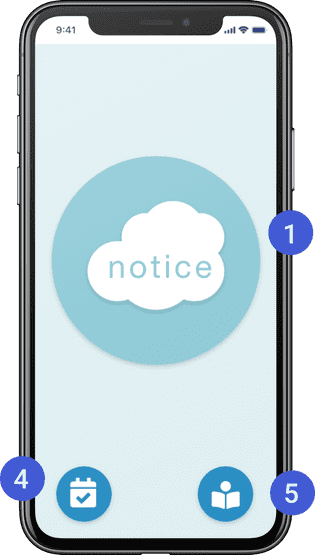
Tap the “Notice Cloud” to notice. Easy to use with calming graphics to avoid overwhelming the user if they are feeling anxious.
2
Once noticed, the cloud becomes a checkmark and the user can choose to take notes.
3
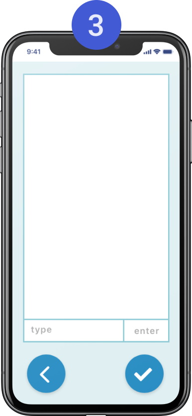
The note-taking screen resembles a chat window. This is a visual representation of “self-talk”, improving mindfulness.
4
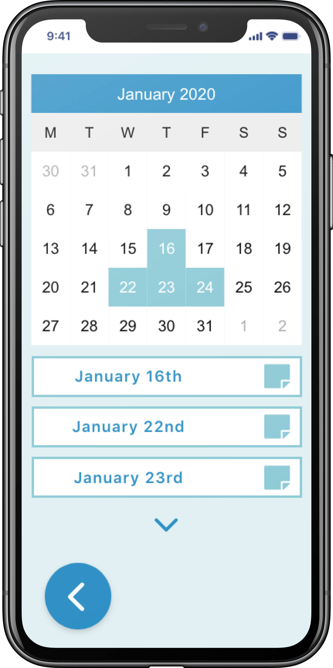
Quickly access a calendar to track progress or instances of noticing. On this screen, you can review your notes as well.
5
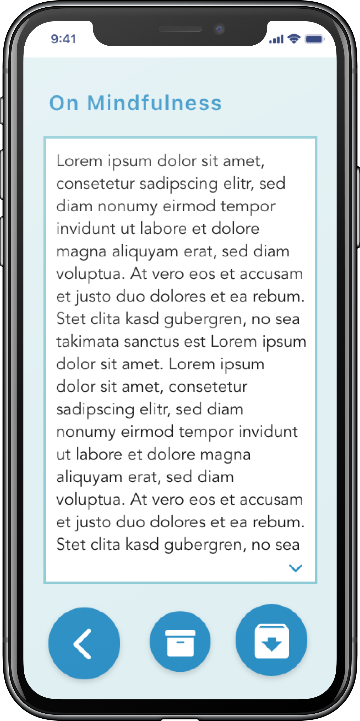
Have five minutes to spare? Read more on mindfulness techniques. Archive helpful articles and review your archive whenever.
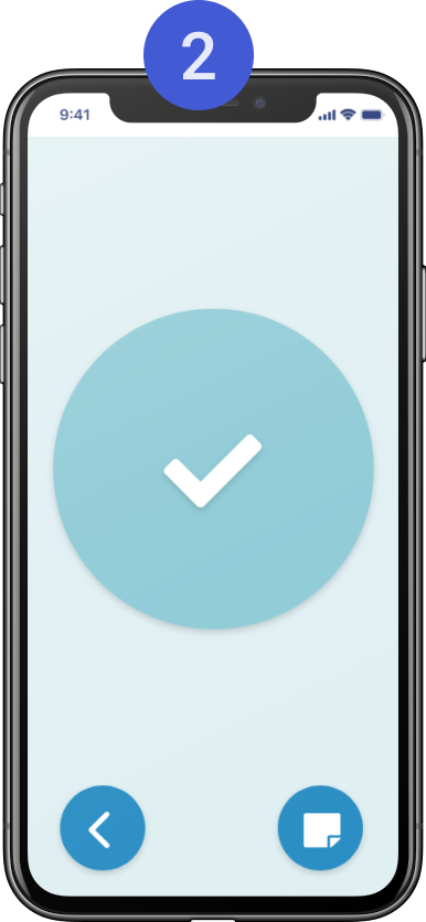
Noticed
Note
Read
Track
Next Steps
The next step continues the cycle of research and iteration. Research such as usability testing will provide important feedback to inform the next iteration of the product. From here, the product continues to evolve.
The design journey continues!

